The Adam Scott invitation is one of my favorites because each time we do it, the look is so different. This is because of the vintage monogram element, and how different each combination of letters looks. This particular beauty was created for the fabulous Needle in a Haystack.
I love the classic black and grey color palette. And the monogram for this couple was...READ MORE

June 30, 2011
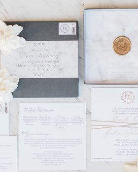
Hot off the Press {yellow + grey chic}
I am in love with this yellow and grey color palette we used for this Adam Scott invitation, created for our fabulous retailer, Chirps and Cheers.
The beauty of the Adam Scott invitation is the unique vintage monograms used that are so different depending on the couple's initials. I am really loving this invitation in these colors I think! Thanks so much Chirps and Cheers!!...READ MORE
June 21, 2011
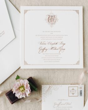
Hot off the Press {romantic glamour}
Here is an invitation suite we did for our fabulous retailer, Where's the Party, in Costa Mesa. I am of course, in love with this pink + charcoal color palette. The soft graphics of the Romantic Glamour suite, lend themselves so well to these colors...what do you guys...READ MORE
June 14, 2011
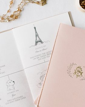
Hot off the Press {Parisian Chic}
I love the color palette of this Parisian Chic invitation suite we did for the fabulous Terra Rosa. What do you guys...READ MORE
May 26, 2011
Real Wedding {Molly + Max}
I am so excited to share this real wedding with you guys. It is such a true romance, and the DIY details are the perfect reflection of the bride and groom. The gorgeous photos were captured by Braedon Photography.
This wedding is so unique, from the venue (a Boy Scout camp), to the moccasins the bride wore. Picnic inspired decor complete with vintage sheets and table cloths to cover the tables and a subtle Native American vibe.
I love when Molly...READ MORE