I am in love with this yellow and grey color palette we used for this Adam Scott invitation, created for our fabulous retailer, Chirps and Cheers.
The beauty of the Adam Scott invitation is the unique vintage monograms used that are so different depending on the couple's initials. I am really loving this invitation in these colors I think! Thanks so much Chirps and Cheers!!...READ MORE

June 21, 2011
Hot off the Press {romantic glamour}
Here is an invitation suite we did for our fabulous retailer, Where's the Party, in Costa Mesa. I am of course, in love with this pink + charcoal color palette. The soft graphics of the Romantic Glamour suite, lend themselves so well to these colors...what do you guys...READ MORE
June 14, 2011
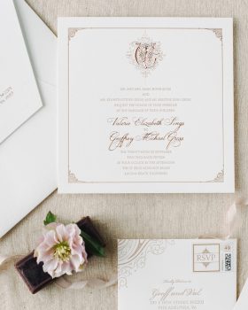
Hot off the Press {Parisian Chic}
I love the color palette of this Parisian Chic invitation suite we did for the fabulous Terra Rosa. What do you guys...READ MORE
June 9, 2011
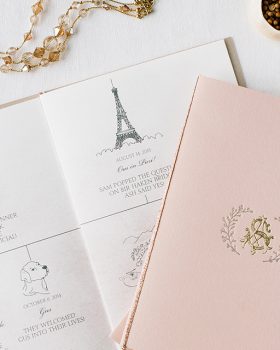
Hot off the Press {under the stars}
I am so excited to share this invitation we created for our darling retailer in Tennessee, Social Graces.
The clients chose the Under the Stars collection. We flat printed the save the dates and the matching pieces. We hand letterpressed the invitations on 2-ply cotton stock. We were thrilled with the results. What do you guys think? Thanks Social Graces for such a fun project!!...READ MORE
May 27, 2011
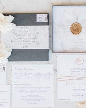
Molly + Max {paper goods revealed}
You got a peek at the invitations yesterday as well as the gorgeous details of Molly + Max's wedding. Well today I wanted to show you a bit more of the paper goods we created for this amazing wedding. To start it off here are the invitations you saw, complete with custom liners and the most adorable illustrations by the bride herself.
The watercolor chevron design is actually a gorgeous painting that was graciously provided by the oh so talented Joanna...READ MORE